
圆角大杀器,使用滤镜构建圆角及波浪效果!
本文,将另辟蹊径,介绍一种使用滤镜去构建圆角的独特方式。
首先,我们来看这样一个图形:

一个矩形,没什么特别的,代码如下:
div {
    width: 200px;
    height: 40px;
    background-color: #000;
}
如果,我们现在需要给这个矩形的两端加上圆角,像是这样,该怎么做呢:

So easy,不过就是加个 border-radius 而已:
div {
    width: 200px;
    height: 40px;
  + border-radius: 40px;
    background-color: #000;
}
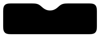
好,那如果,不再是直线,而是一条曲线,希望曲线两端,带有圆角,像是这样,又该怎么办呢:

到这,基本上触及了传统 CSS 的天花板,想通过一个属性搞定这个效果是不太可能了。
当然,有这样一种方式,通过首尾两端,利用两个伪元素,实现两个圆形,叠加上去:

emm,这也是一个可行的方案,主要是定位会稍微有点点麻烦。那么除了这个方式以及直接使用 SVG 外,还有没有其他方法能够实现带圆角的曲线?
有!在 CSS 中,我们还可以通过 filter: contrast() 配合 filter: blur() 这对组合来实现这个图形。
filter: contrast() 配合 filter: blur() 的奇妙化学作用
在 神奇的滤镜!巧妙实现内凹的平滑圆角[1] 一文中,其实已经介绍过这个组合的另类用法。
经常阅读我的文章的小伙伴,对 filter: contrast() 配合 filter: blur() 的组合一定不陌生,上经典的一张图:

单独将两个滤镜拿出来,它们的作用分别是:
-
filter: blur():给图像设置高斯模糊效果。 -
filter: contrast():调整图像的对比度。
但是,当他们“合体”的时候,产生了奇妙的融合现象。
仔细看两圆相交的过程,在边与边接触的时候,会产生一种边界融合的效果,通过对比度滤镜把高斯模糊的模糊边缘给干掉,利用高斯模糊实现融合效果。
当然,重点来了,blur 与 contrast 滤镜的组合不仅能用于这种融合效果,其特殊的性质使得它们的组合可以将直角变成圆角!
先看看之前的一个例子:
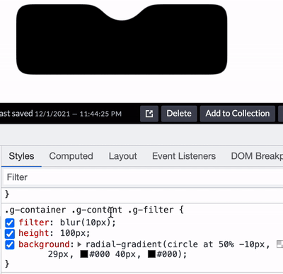
首先,我们只需要实现这样一个图形:
div class="g-container">
    div class="g-content">
        div class="g-filter">div>
    div>
div>
.g-container {
    position: relative;
    width: 300px;
    height: 100px;

    .g-content {
        height: 100px;

        .g-filter {
            height: 100px;
            background: radial-gradient(circle at 50% -10px, transparent 0, transparent 39px, #000 40px, #000);
        }
    }
}
得到这样一个简单的图形:

看到这里,肯定会疑惑,为什么这个图形需要用 3 层 div 嵌套的方式?不是一个 div 就足够了吗?
是因为我们又要运用 filter: contrast() 和 filter: blur() 这对神奇的组合。
我们简单改造一下上述代码,仔细观察和上述 CSS 的异同:
.g-container {
    position: relative;
    width: 300px;
    height: 100px;

    .g-content {
        height: 100px;
        filter: contrast(20);
        background-color: white;
        overflow: hidden;

        .g-filter {
            filter: blur(10px);
            height: 100px;
            background: radial-gradient(circle at 50% -10px, transparent 0, transparent 29px, #000 40px, #000);
        }
    }
}
我们给 .g-content 添加了 filter: contrast(20) 和 background-color: white,给 .g-filter 添加了 filter: blur(10px)。
神奇的事情发生了,我们得到了这样一个效果:
通过对比度滤镜把高斯模糊的模糊边缘给干掉,将原本的直角,变成了圆角,Amazing。
通过一个 Gif 图更直观的感受:
完整的代码你可以戳这里:CodePen Demo – Smooth concave rounded corners By filter[2]
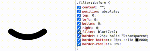
通过滤镜实现圆角圆弧
到这里,你应该知道如何通过直角圆弧得到圆角圆弧了。就是借助 filter: contrast() 配合 filter: blur() 的组合。
直接上代码:
div {
    position: relative;
    width: 250px;
    height: 250px;
    filter: contrast(20);
    background-color: #fff;
    overflow: hidden;
}
div::before {
    content: "";
    position: absolute;
    top: 0;
    left: 0;
    bottom: 0;
    right: 0;
    filter: blur(7px);
    border: 25px solid transparent;
    border-bottom: 25px solid #000;
    border-radius: 50%;
}
效果如下:

通过 Gif 看,更加直观:
CodePen Demo — Arc with rounded corners[3]
使用 filter: contrast() 配合 filter: blur() 实现波浪效果
好了,有了上面的铺垫,我们再来看一个有意思的。使用 filter: contrast() 配合 filter: blur() 实现波浪效果。
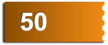
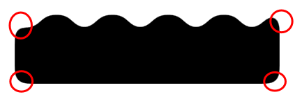
在之前,我们如果想使用纯 CSS,实现下述的波浪效果,是非常的困难的:
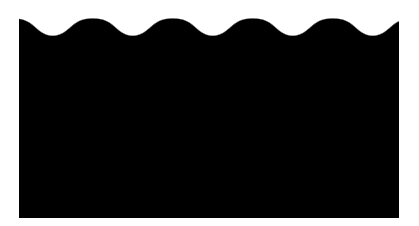
这种波浪效果,通常会使用在优惠券等切图中:
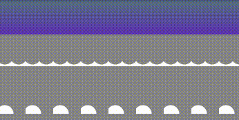
在之前,我们是怎么去做的呢?如果不切图,使用纯 CSS 的话,需要使用两层渐变进行叠加,大概是这样,感受一下:
其代码也比较复杂,需要不断的调试渐变,使两个径向渐变吻合:
div {
    position: relative;
    width: 400px;
    height: 160px;
    background: linear-gradient(90deg, #945700 0%, #f49714 100%);

    &::before,
    &::after {
        content: "";
        position: absolute;
        top: 0;
        right: 0;
        bottom :0;
    }
    &::before {
        width: 10px;
        background-image: radial-gradient(circle at -5px 10px, transparent 12px, #fff 13px, #fff 0px);
        background-size: 20px 20px;
        background-position: 0 15px;
    }
    &::after {
        width: 15px;
        background-image: radial-gradient(circle at 15px 10px, #fff 12px, transparent 13px, transparent 0px);
        background-size: 20px 40px;
        background-position: 0 15px;
    }
}
那么,如果使用 filter: contrast() 配合 filter: blur() 的话,整个过程将会变得非常简单。
我们只需要实现这样一个图形:
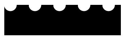
这个图形使用渐变是容易得到的:
div {
    background: radial-gradient(circle at 20px 0, transparent, transparent 20px, #000 21px, #000 40px);
    background-size: 80px 100%;
}
按照上文介绍的技巧,只需要应用上 filter: contrast() 配合 filter: blur(),就能将锐利的直角转化成圆角。我们尝试一下:
div class="g-container">
    div class="g-inner">div>
div>
.g-container {
    position: relative;
    margin: auto;
    height: 200px;
    padding-top: 100px;
    filter: contrast(20);
    background-color: #fff;
    overflow: hidden;
}

.g-inner {
    position: relative;
    height: 200px;
    background: radial-gradient(circle at 20px 0, transparent, transparent 20px, #000 21px, #000 40px);
    background-size: 80px 100%;
    filter: blur(10px)
}
可以写在 1 个 DIV 里面(通过元素和它的伪元素构造父子关系),也可以用 2 个,都可以,问题不大。
得到如下所示的波浪图形:
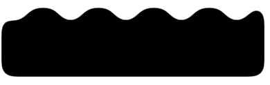
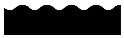
我们希望它波浪的地方的确是波了,但是我们不希望的地方,它也变成了圆角:
这是 filter: blur() 的一个问题,好在,我们是可以使用 backdrop-filter() 去规避掉这个问题的,我们简单改造下代码:
.g-container {
    position: relative;
    width: 380px;
    padding-top: 100px;
    filter: contrast(20);
    background-color: #fff;
    overflow: hidden;

    &::before {
        content: "";
        position: absolute;
        top: 0;
        left: 0;
        bottom: 0;
        right: 0;
        backdrop-filter: blur(10px);
        z-index: 1;
    }
}
.g-inner {
    position: relative;
    width: 380px;
    height: 100px;
    background: radial-gradient(circle at 20px 0, transparent, transparent 20px, #000 21px, #000 40px);
    background-size: 80px 100%;
}
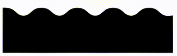
这样,我们就实现了一份完美的波浪效果:
部分同学可能对上面的
padding-top 100px有所疑惑,这个也是目前我所发现的一个 BUG,暂未解决,不影响使用,你可以尝试将 padding-top: 100px 替换成 height: 100px。
基于这种方式实现的波浪效果,我们甚至可以给它加上动画,让他动起来,也非常的好做,简单改造下代码:
.g-inner {
    position: relative;
  - width: 380px;
  + width: 480px;
    height: 100px;
    background: radial-gradient(circle at 20px 0, transparent, transparent 20px, #000 21px, #000 40px);
    background-size: 80px 100%;
  + animation: move 1s infinite linear;
}

@keyframes move {
    100% {
        transform: translate(-80px, 0);
    }
}
通过一个简单的位移动画,并且使之首尾帧一致,看上去就是连续的:
完整的代码,你可以戳这里:CodePen Demo — Pure CSS Wave[4]
总结一下
本文介绍了一种使用 filter: contrast() 配合 filter: blur() 的方式,将直角图形变为圆角图形的方式,在一些特定的场景下,可能有着妙用。
不过,这种方式也有几个小缺陷:
-
使用了 filter: contrast()之后,图形的尺寸可能相对而言会缩小一点点,要达到固定所需尺寸的话,要一定的调试 -
此方式产生的图形,毕竟经过了一次 filter: blur(),放大来看图形会有一定的锯齿,可以通过调整 contrast 和 blur 的大小尽可能的去除,但是没法完全去掉
当然,我觉得这两个小缺点瑕不掩瑜,在特定的场景下,此方式还是有一定的用武之地的。
最后
本文到此结束,希望对你有帮助 🙂
想 Get 到最有意思的 CSS 资讯,千万不要错过我的公众号 — iCSS前端趣闻 ?
更多精彩 CSS 技术文章汇总在我的 Github — iCSS[5] ,持续更新,欢迎点个 star 订阅收藏。
如果还有什么疑问或者建议,可以多多交流,原创文章,文笔有限,才疏学浅,文中若有不正之处,万望告知。
参考资料
神奇的滤镜!巧妙实现内凹的平滑圆角: https://github.com/chokcoco/iCSS/issues/154
[2]CodePen Demo – Smooth concave rounded corners By filter: https://codepen.io/Chokcoco/pen/JjroBPo
[3]CodePen Demo — Arc with rounded corners: https://codepen.io/Chokcoco/pen/bGveoPY
[4]CodePen Demo — Pure CSS Wave: https://codepen.io/Chokcoco/pen/PoRzeav
[5]Github — iCSS: https://github.com/chokcoco/iCSS

如果觉得还不错,欢迎点赞、收藏、转发❤❤❤